I would argue that color is one of—if not—THE biggest aspect of a brand that conveys mood. There are so many feelings associated with specific colors and those emotions can change depending on the variation of the color. To make things even more complicated, the mood evoked can change depending on what hue that color is paired with! Deciding on colors for a brand, house decor, or art piece can feel very overwhelming, but the truth is—it doesn’t have to be! Deciding on a color palette is actually one of my favorite parts of the brand process. That’s why I decided to create this quick guide to picking a color palette for your brand.
01. Establish the Mood.
Instead of looking to other brands or color palettes that you like, let’s start at the basics—this is the best way to create a color palette that is truly unique to you. It can be difficult to separate your personal preferences from what’s actually best for the brand. To help my clients do this, I always give them an in depth questionnaire that really gets to the heart of their brand. Some of these questions might be helpful to gear your brain in the right direction:
- How do you want people to feel when they see your brand?
- What are some words that describe you brand?
- If your brand was a store, what store would it be?
- If your brand was a room in a home, what would that room be? How would it be decorated?
- If your brand was an item of clothing, what would it be? How would it look?
- If your brand was a season, which would it be?
These are just some questions to spark some ideas and get you thinking about your brand in a different way and from the perspective of your ideal client. These answers will be very helpful to keep in mind throughout the next steps.
Before I move on to the next step, I like to do a quick brainstorm about what colors would reflect the brand’s tone best. This gives me some ideas and colors to keep in the back of my head to look for as I begin creating my mood board. The key here is to make sure the colors you are envisioning keep in line with the mood you’ve established above.
02. Create a Mood Board.
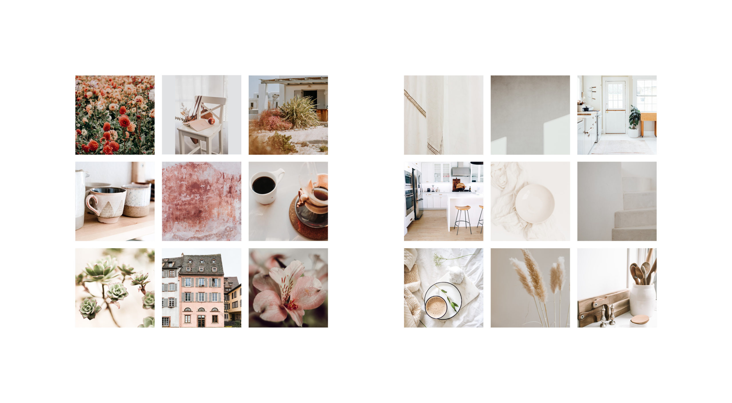
This is the fun part! Your goal is to create a mood board that captures the emotions and feelings you want to evoke when people view your brand. What I usually do is create a board on Pinterest and pin anything I see that reflects the tone I’m going for. I try to stay away from pinning other people’s designs and color palettes, and instead focus on pinning images that feature items or colors that convey the mood of the brand. This is where your answers to the questions above come in handy.
*Please note: if creating a mood board for anything other than personal use, make sure to use a platform with free photos such as unsplash.com.
Here’s some helpful prompts to get you started:
- Pin pieces of furniture and decor that would be found in your “brand room.”
- Pin the articles of clothing that reflects your brand.
- Pin the items that would be found in your “brand store.”
- Pin images of the season that resembles your brand.
Use your brand “key words” to guide you:
- If your brand is very organic, pin pictures of nature and plants.
- If your brand is elegant, pin pictures of fancy wedding place settings and nice couches.
- If your brand is sharp and professional, pin images of architecture and geometric patterns.
- If your brand is neutral and earthy, pin images of hand-made pottery and dried flowers.
The key is to not over-think it and just pin as much as you can! You can always go back through and remove pins to narrow it down once you have an idea of your aesthetic. When you go back through, it is helpful to think about the colors in the images and try to form a clear vision of the color palette for your brand—make sure to save pins that feature the colors that you want your brand to have. Once you click on a pin, you can scroll down to view the “related pins” which can help prompt more ideas.
Once your board is created, save your favorite images. I usually recommend saving 6-9 images to really give some variety. Take these images and arrange them into an actual mood board! (For our purposes, it doesn’t have to be pretty).
03. Pick Your Colors!
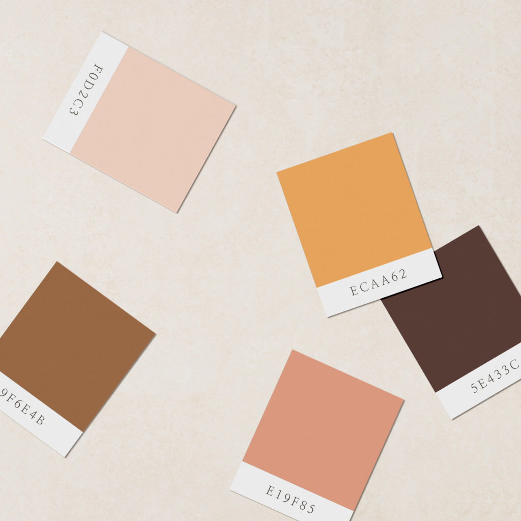
Once you’re satisfied with your mood board and it truly evokes the tone and style of your brand, use an eye dropper tool to pick out specific colors from the images. Doing this helps you create a palette that is truly unique! If you don’t have any adobe products with an eye dropper tool, Chrome has an extension that you can get, or you can upload your board to a site like this one.
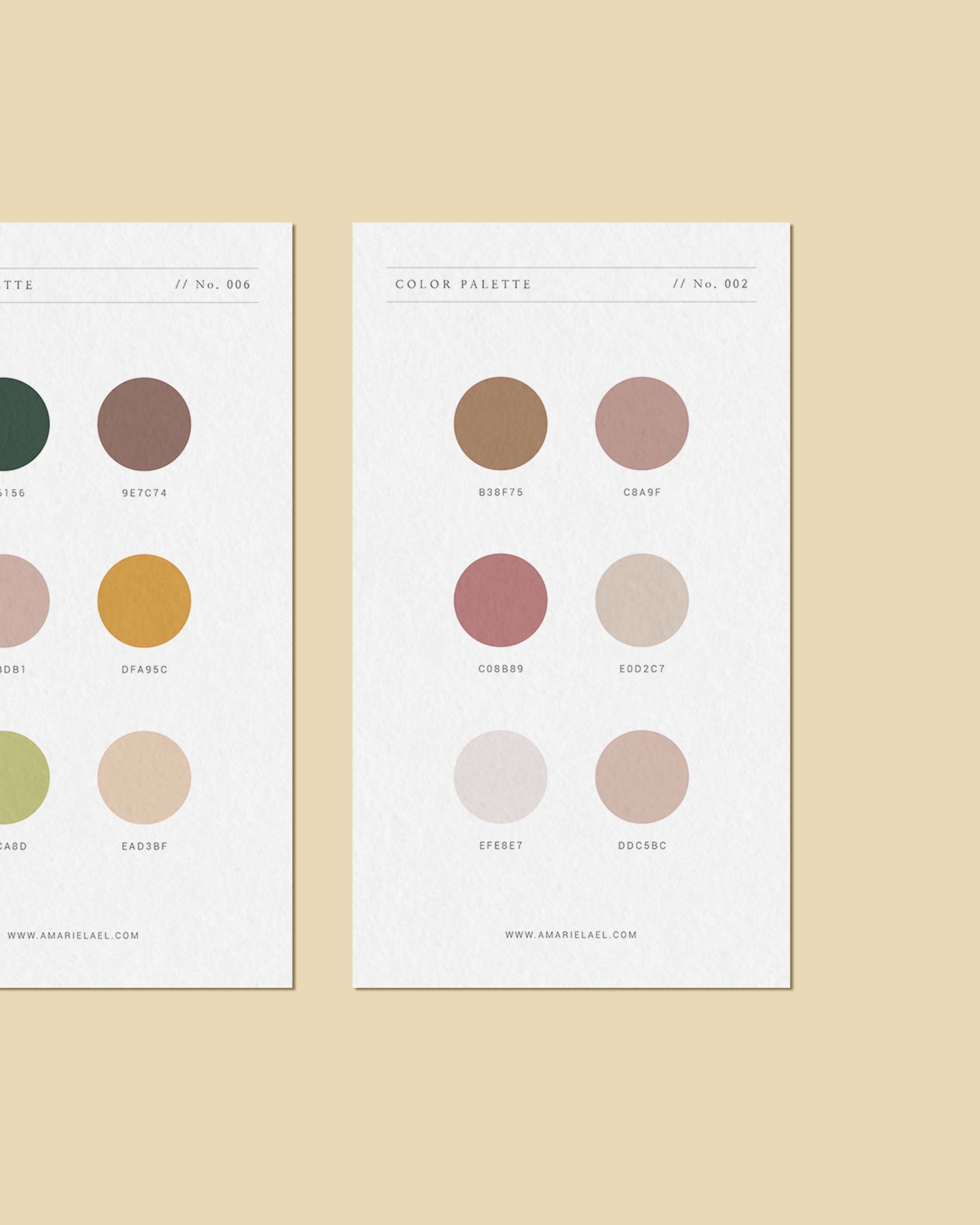
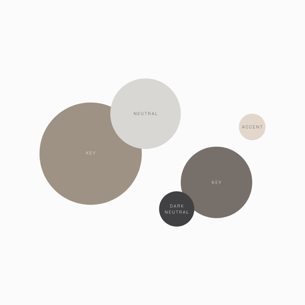
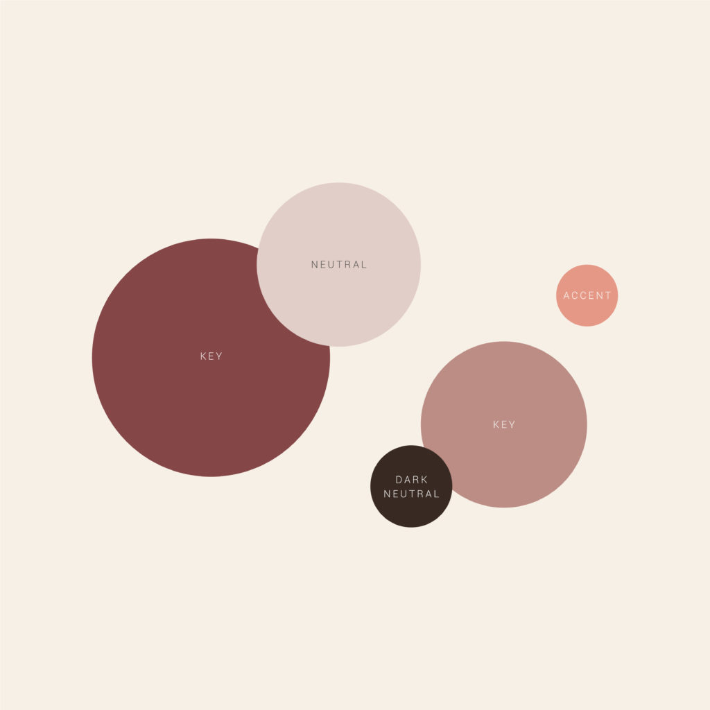
Think about choosing 5 – 8 colors. Less is always more—It is important to choose some neutral colors along with the bright bold colors to give your palette variety. I recommend choosing:
1 dark neutral, 1-2 key colors, 1-2 accents, and 1-2 neutrals
Dark Neutral: This color is so dark, it’s almost black and is mostly used for text and little accents throughout. It usually has warm or cool undertones that make it unique and fit with your brand. For example, in my brand I use a dark, warm brown.
Key Colors: These colors are the main colors of the brand and are your go-to’s when deciding on a logo color, color of a title, or color of a background. For my brand, these colors would be the dusty terra cotta orange and light beige-y brown that you seen throughout my website. These are the colors that really define the tone and style of your brand.
Accents: These are the colors that are bold enough to stand out but still complement the key colors. These colors are used for accents in designs and to bring attention to certain items. For example, the sage green in my brand is an accent color that is used for buttons and icons throughout my website.
Neutrals: I like to think of these colors as the backbone of the brand—these colors function best when they don’t stand out or compete with the main colors and instead, complement them and stay in the background. They are best used in the backgrounds of designs. In my brand, these are the very light tans and grays that are in the background of many sections on my website.
04. Cross-Reference
You’re almost there! Look over everything one more time and make sure it all falls in line with the research and strategy you established at the beginning. Does the mood board line up with the key words you came up with? Does your color palette match the mood board?
Like I mentioned at the beginning of this post, color is very expressive, so it is SO important that your color palette lines up with your style and intended mood.