As most of you know, I recently launched my new website. As I created my new website, I spent hours upon hours researching and learning how to structure my site and my business. I spent a good part of the process just looking at other successful creative entrepreneurs’ websites and how they structured them and then implemented what I learned into my current website.
A little while ago, I decided to take a peek at my old website and was SHOCKED at the difference. My new website is so much more strategic, focused, and refined. What my business is and the specifics of what I offer are very clear in the first few seconds someone enters my site. As I’ve begun working on other people’s websites, I have found that so many sites have the same problem that my old site had:
What they offer/do isn’t very clear to the average viewer.
You’re probably thinking, “That’s it? Really?” And I know, it seems so obvious and straightforward, doesn’t it? But I see it ALL THE TIME (including on my own (old) website)! Here’s what happens:
We know our business from the inside, out. We’ve spent hours upon hours structuring it, creating our processes, marketing, and all the things that go into starting a business. Our businesses are an extension of ourselves, so what we offer seems so obvious. We forget that the majority of people who come to our sites are coming there for the first time and have no idea what is is that we do. If what we do, why we do it, and how it can help them isn’t clear from the get-go, then there’s a good chance we may lose their business.
This is something that most of us might not even be aware our website is lacking. Below, is a list of things that we can do to make sure our website is focused and strategic, so we can get those dream clients!
01. Put the details of what you do front and center.
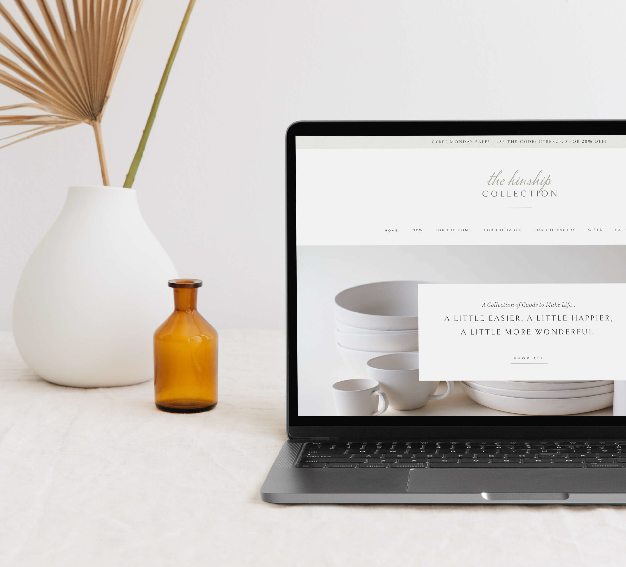
When someone enters your site for the first time, it is very important that they don’t have to look far to figure out the specifics of what you do. If one of your logos has a tagline that explains the focus of your business (mine has a line that says “a branding & web design studio”), then make sure that is front and center.
If your logo doesn’t explain the specifics of what you do, then include a short sentence that lists of the services you offer or goes into a little more detail about what you do.
If you’re selling a product, discuss that product. If you provide a service, explain what it is. If you provide educational, inspirational content, then say that! Make sure that the first thing that catches your viewer’s eyes is an explanation of what it is that you do/sell.
02. Answer the questions: What? Who? Why? How?
Out of all these, this is probably the most important thing you can do. When people come to your site, the answers to these questions should be apparent.
What?
What services/products do you offer? Go in to detail about what they get if they decide to invest in your products or services. What does the process look like when working with you? People want to know what they are getting in return for their money.
Who?
Who do you serve? What do your ideal clients look like? What kinds of people/businesses are your services designed for?
Why?
Why have you decided to start this business? Why do you do what you do? Why should they invest in your products/services? Answering these questions serves to make you more relatable to your website visitors, showing the passion behind what you do. It also helps the viewers understand how your services can be a solution to a problem/need they have.
How?
If they like your services/products, how do they move forward in working with you or purchasing your product. If the next step is to contact you to book a consultation, then have a link to the contact page at the bottom of most pages. If the next step is to purchase a product, then link to your shop throughout your site.
TIP: The answers to “why” and “How?” don’t have to be on the home page, but should be included throughout the rest of your site.
03. Use simple language
We may be experts on our business, but our viewer’s aren’t. It happens to me all the time where I go to a website and have to read the copy over and over to understand what they are talking about. We want the copy of our websites to be straightforward and easy to comprehend. When you use big words and terms that are very specific to your business and area of expertise, it can be off-putting to a potential client. People have small attention spans, and don’t want to spend time deciphering what it is that you do.
04. Be selective with your information: less is more
Although many website don’t go into enough detail about their business, it is also easy to over-do it. Like I said before, peoples’ attention spans are only so big, and they don’t want to take the time to sift through the many paragraphs of your website to decide if your services/products are right for them. Be straightforward with your information, get to the point, and don’t write things for the sake of having information.
On the home page, it is important to only include a brief description and then have a link to another page on your website that goes into more detail if they want to read more. It can be overwhelming looking at a page full of text, so breaking it up throughout your site and guiding people through it can make it feel more manageable.
05. Put yourself in your visitors’ shoes
Try to view your website though the lens of someone who has just discovered you for the first time. Is all the information there that you would want to know before making a purchase? It also helps to watch someone as they go through your site for the first time. Where do they stop and read? Where do they click through to the next page?
TIP: Consider even having a close friend or family member view your site and give feedback on whether they have any questions about your business.
I hope this post was helpful and gave you some ideas for where you can enhance the content on your site. My website is constantly a work in progress, and I am always looking for ways to strategically guide my audience through the site and explain to them what I do.


