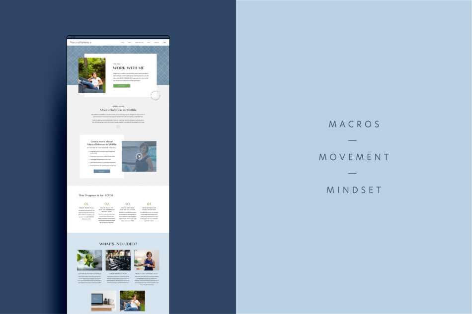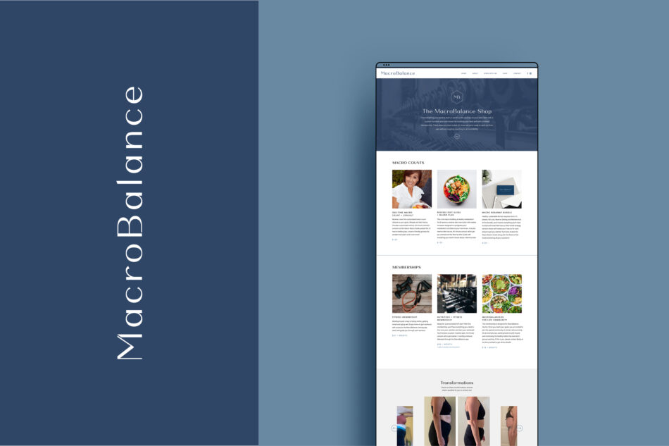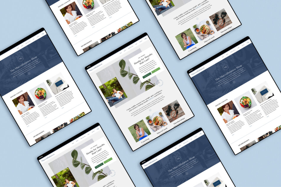
I am so excited to announce the launch of this fun, clean, and inspiring brand: MacroBalance. This project is especially one that is near and dear to my heart because it is for my aunt, Becky Podhajsky. MacroBalance aims to redefine the way we think about food & fitness and begin to have a healthy life that is achievable and sustainable. Becky offers teaching about how to find the balance of eating healthy and fueling your body, but not being so strict that you aren’t able to enjoy a treat every once in a while (because we all know, that isn’t truly sustainable). Her focus is primarily on women in their menopausal or peri-menopausal years, but what she teaches is applicable to all all ages and genders.
Together, we wanted to create a brand that is timeless, clean, simple, and inspiring. The designs we landed on use a lot of clean lines and geometric shapes / patterns. We incorporated a hexagon shape in the brand icon that is reflected throughout the rest of the patterns. With a timeless color palette made up of muted blues, an accent of green, and clean typography, this brand feels fresh, new, and inspiring and reflects how the Becky’s students feel when they’ve completed the training and find balance in their lifestyle and mindset.
Services: Branding + Collateral


