Sometimes I wonder how Instagram evolved from a social media platform with blurry pictures with our friends or silly photos of our pets to perfectly curated, cohesive feeds and stylized, edited photos. Well, despite what it once was, it’s obvious that being intentional and strategic with our instagram posts is very important—ESPECIALLY if you’re a business owner or work in an industry that is visually focused like photography or design. It can feel really overwhelming when we start to look around at all the beautiful feeds. How do they do it? It seems like it takes so much effort! Well it’s not an exact science, but there are some things you can do to get that insta-worthy feed. 😉 The first step to having a cohesive instagram feed is to…
01. Plan Ahead!
Planning is foundational to creating a cohesive feed—without planning, the following points wouldn’t even matter. Planning your feed allows you to think through what you want to post as well as how it’s all going to look together.
TIP: I plan out my feed at least a month in advance (sometimes more) by using a planning app such as Planoly, Plan, or Preview (I’ve used all 3 and Preview is currently my favorite).
I’ll upload any graphics/photos I’d like to post within the next month and experiment with the layout until I feel it’s cohesive and balanced. I usually end up changing things around throughout the month as I add new photos I’ve taken or graphics I’ve created that I’d like to post. Here are some tips to keep in mind when planning your feed:
02. Alternate Post Types
As I plan my feed, I have found that the best way to create balance is to alternate the types of images I post. For example, I post photos along with design graphics, so often times, I will alternate between a design graphic and a photograph. This ends ups creating a balanced composition as photos tend to be busier than my designs. In addition to that, this is better strategically because it keeps my followers updated with my design work as well as my life beyond my business.
Another thing I do is to alternate dark posts with light posts. Again, this creates a cohesive look as people view my feed. Of course, in certain situations, I might end up breaking some of these “rules” I’ve talked about here, but they are good guidelines to keep in mind when designing a feed.
When planning your feed, think about the different kinds of images you post and consider alternating those.
Maybe it would be to alternate flat lays with scenery/portrait images?
Maybe it would be alternating portrait shots with scenery photos?
Maybe it’s alternating primarily green images with images that are more neutral?
03. Use Similar Colors
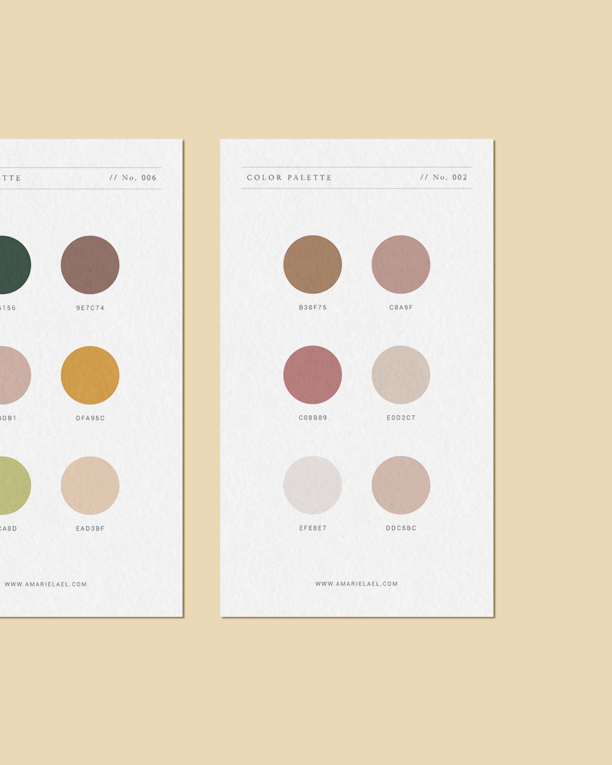
If you take a look at my feed, you’ll see that I use a lot of neutral colors, with pops of sage green, dusty pink, and terra cotta orange. This is very intentional—I make sure to use similar colors when I design my posts as well as edit my photos. If you want to learn more about editing photos, check out this post.
Establish your brand color palette
A good way to make sure you’re doing this is to first, establish what these color would be. It’s a good idea to have these colors match your brand color palette in order to create a unified brand identity throughout all aspects your business
TIP: If you want to learn how to pick a color palette for your brand, check out this post.
If your brand’s color palette uses mostly cool colors (blues and greens) and neutrals, then don’t choose one of the colors for your feed to be fuchsia pink. You don’t have to ONLY stick with colors that are ONLY in your palette, but try to choose colors that fit within you brand mood and style. For example, if you you tend to wear lavender a lot in your photos, it is okay for one of your colors to be lavender in addition to the cool and neutral tones.
Take photos that feature these colors
Once you’ve decided on these colors, a good way to make sure they show up in your feed is to keep your eye out for photo ops that feature these colors. Maybe that would be stopping to snap a quick photo in front of a mural that has your shade of pink or snapping a picture of a flower along the sidewalk that is the perfect yellow.
If you want to take this idea a step further, think about purchasing clothing and house decor that resemble your brand colors. Hopefully this will happen naturally since your brand colors are usually a reflection of you and your style!
Transition colors in and out of your feed
If you do want to bring in a pop of color that isn’t one of your usual brand colors, make sure to create a few more posts that feature this color to go around it and kind of “fade” it in and out of your feed.
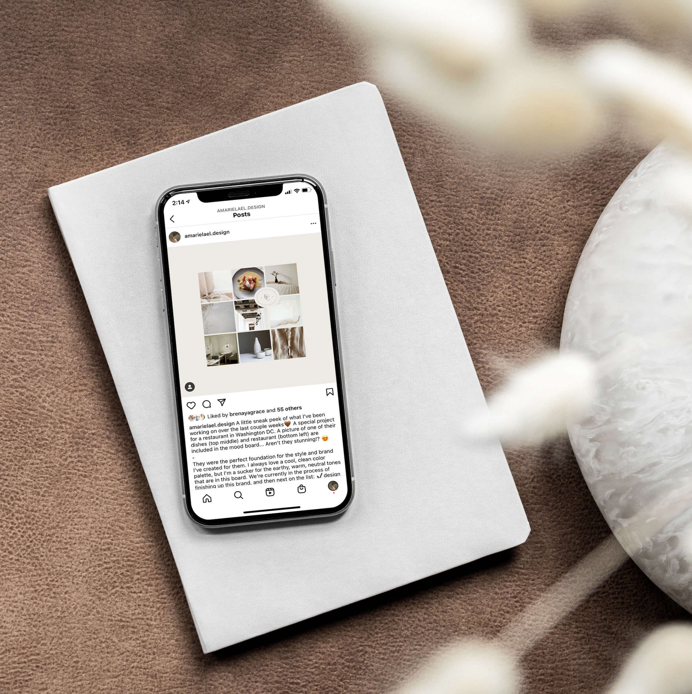
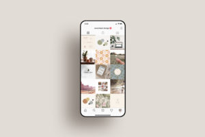
For example, in the photo below, you can see that in the middle-right of the feed, I posted a bold graphic with a blue background and illustrated pattern. Around that post, I posted a few color palettes that also include shades of blue that are similar. By incorporating similar colors around the pop of colors, it creates a cohesive look as people scroll through my feed.
There is one more thing I’d like to mention: although creating a cohesive feed is important and will definitely attract people to follow your account, there are so many other aspects of Instagram that are important to keep in mind when building a brand and business on Instagram such as creating engaging content and using social media as a platform through which you can serve your audience. Instagram is a very visual platform, but it’s also an app that’s all about making connections and providing education, so a beautiful Insta feed alone isn’t going to bring you your ideal clients / customers… but that’s a blog post for another day!
I hope that these tips will spark some ideas for how to improve your posts and feed. DM me on Instagram if you found these tips useful—I’d love to see your feed!
If you’d like to learn more about how to edit your photos to match your feed, make sure to check out my next blog post in this series: