Editing photos to be cohesive can seem like a pretty daunting task—especially when we see so many beautifully curated photos all over Instagram. Investing in presets is a great way to have a unified look for you images, but in order to make the most of those presets and develop a style that is unique to you and fits your brand, it is helpful to understand some key aspects of editing photos and how to create a unique editing style.
Please note: this post is the second in a 2 part series about how to create a cohesive feed on the gram. If you haven’t already, make sure to check out this post about planning out your feed in advance—a foundational step in building a balanced feed.
TIP: I use Lightroom to edit all of my photos. A free, mobile version can be downloaded and has all the capabilities that I talk about in this post.

01. Keep the lighting and location in mind
In order to truly keep your photos cohesive, the first thing to keep in mind is where you are taking the photos and the lighting at that location. Your brand has a mood and a tone and it is important to take/use photos that stay within that. For example, my brand is minimal and neutral, with accents of organic textures and warm colors. Because of this, a lot of my photos are taken in bright places either inside or outdoors with minimal colors. Even though it might make for a cool photo, it wouldn’t make a lot of sense for me to do a shoot inside a dark room by a window with high-contrast shadows.
There is only so much that editing can do when the style of a photo from the get-go doesn’t match the brand. Make sure to think through the style of your brand and only take photos in places where the lighting and situation line up with it. If you use photos from a free platform like unsplash, make sure to look for photos that match your brand style. For example, don’t use minimal, neutral photos if your brand uses a lot of vibrant colors and bold patterns.
TIP: always try to take photos in situations with even light (in the shade). The photos that are most difficult to edit are the ones that have harsh shadows and are taken outside when the sun is high in the sky or inside with artificial light coming from above.
*Remember that editing another photographer’s professional photos that they’ve edited in their own unique style can be illegal, so the next tips only apply if you’re editing your own photos or images you’ve gotten off of a free platform like unsplash or pexels.
02. Double-check the exposure
This may seem obvious, but it can be amazing how after staring at a photos for so long, you don’t realize how much lighter or darker the photo actually needs to be. iPhones do a pretty good job of keeping the exposure similar in all situations, but it never hurts to double-check the exposure and make sure it matches the rest of your photos.
In addition to that, try to use similar settings for the lighting (found under the “lighting” adjustments) whenever you edit. Of course each photo is a little different and will need specific adjustments, but using similar settings across all your photos will help to create a unified look. For example, when I edit my photos, I usually adjust everything in a similar manner, just to different degrees: lighten the exposure a bit, up the contrast, lower the highlights and whites, darken the shadows a bit. Almost always, these are the edits I make to each of my photos and they result in photos that feel cohesive and have a similar style.
03. Make sure the temperature is the same
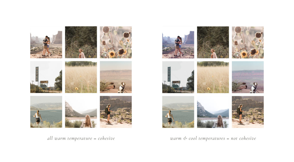
This may be the most common mistake I see when people edit their photos, and nailing this will be foundational in making your photos feel much more cohesive. Again, this is an adjustment that is hard to notice after you’ve stared at a photo for so long. Take a look at the difference in the example below of a set of cohesive photos with warm temperature vs. the same photos that use a mixture of warm and cool temperatures. Isn’t it crazy how much more cohesive the first example is!?
When adjusting the temperature of your photos, first, establish whether your brand photos should be warm or cool. This depends on what would fall in line with your style and color palette. For example, if your brand uses cool colors like greens and blues, then make sure your photos are cooler on the temperature scale. If your brand uses warm colors like oranges and pinks, make sure your photos are warm as well.
Once you’ve established this, play with the temperature slider (found under the “color” adjustments with blue on the left side and yellow on the right side) and make sure your photos all have a similar temperature.
Often times, photos can look good at a much cooler or warmer temperature than you might think after staring at a photo for a while, so make sure to really play with the slider, compare it with other photos that you’ve taken, and take a break from staring at it and come back to it after a while. Just make sure to not overdo it—no one likes an over-edited photo
04. Use the HSL sliders
Ahhhh, the HSL sliders, my favorite and possibly the most powerful adjustment to play with in Lightroom (they are the adjustments that are used most in presets). This is where the magic happens! These sliders are found under the color adjustments once you click on the “mix” button in the top right corner.
These can take some getting used to, but they do so much to make your photos cohesive. Here, you can adjust the hue, luminance, and saturation for every color in the picture. The hue adjusts the “color” of the color (lol!). For example, under the green, the hue slider makes the greens more yellow as it moves to the left and more blue as it moves to the right. The saturation slider adjusts the vibrance of the color.—as you move the slider to the left, it makes the color more gray and if you move it to the right, it makes it more vibrant. The luminance slider makes the specific color brighter (left) or darker (right). My favorites to adjust are the hue and saturation.
In order to make your photos look unified, these sliders can be used to give your photos a specific style and similar colors throughout. The best way to learn how to use these sliders is to practice, practice, practice. I have spent hours upon hours editing and re-editing my photos to figure out my style and I’m STILL adjusting it all the time. However, here are some tips to keep in mind as you get started:
- Adjust the sliders in a similar manner for all your photos.
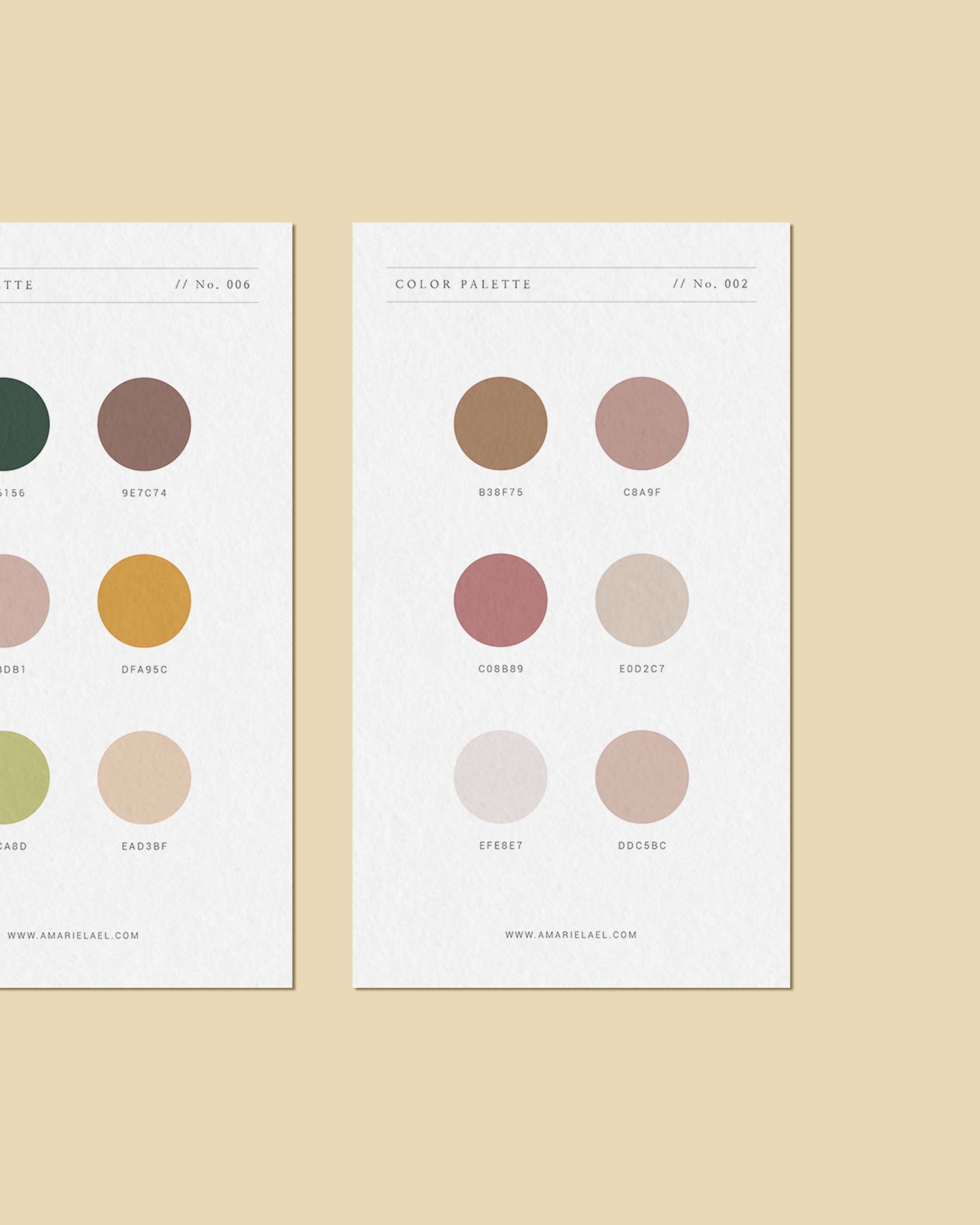
- Decrease the saturation for any colors that don’t match your brand’s color palette. If you want to learn how to pick a color palette for your brand, check out this post.
- Certain colors are more prominent than others, so adjusting these colors will have a greater impact on the style of the photo. Experiment with adjusting the sliders for the more prominent colors such as green, orange (found in most skin tones), and yellow.
- Adjust the hue of colors to match you brand color palette. For example, if pink is a strong color in your brand, move the hue slider under red to the left to make the red tones more magenta.
As you can see, there’s an endless amount of adjustments you can make with these that start to create a unique style and as a result, a cohesive feed. Like I mentioned above, the best way to figure these out is to play around with them until you land on a style that fits your brand.
I hope these tips give you some good direction for how make your photos cohesive as well as an introduction to all the possibilities of editing. Investing in presets is a great way to begin to nail down your look, but understanding how to edit and use the HSL sliders can really help you develop a style that is unique to you!
If you like this post and haven’t done this already, be sure to check out my other post that is related to this one: